
White Knight’s Gaming Room Rebrand
Deliverables
1 Logo
1 Website
Homepage
Locations
Events
About
Gallery
1 Brochure
About
Tournaments and Event Info
Info for Locations
Advertising Info
Instagram Page
3 Environmental Graphics
1 Billboard
1 Bag
3 Stickers
Propsal
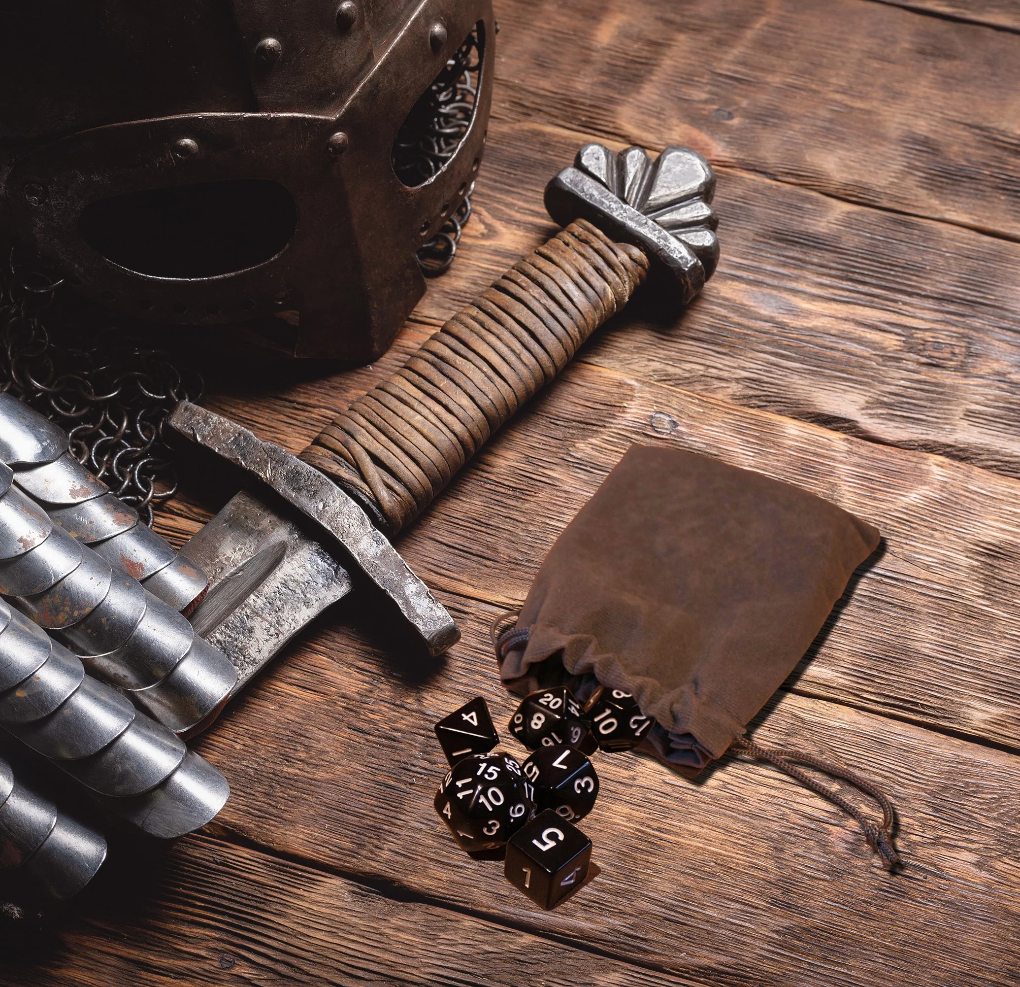
White Night’s Gaming Room is a chain of local hobby game stores in Pennsylvania.
The company started in 2000 in Williamsport, PA, at the Pajama Factory. The store was an outlet for individuals who enjoy board games and want to play with family, friends, and other locals. They supply and sell hobby board games, card games, and hobby
game accessories.
The goal of this redesign is to create a fresh, modern look that would bring more people into board games. This rebrand will capitalize on the social aspect of playing board and card games. To ensure this, the brochure and website will contain information on how people can join and participate in their in-store events including D&D game nights, card game tournaments involving Magic: The Gathering, Pokémon, and Yugioh, and free-play days where people can bring and play any game and are encouraged to play together as a community. Their Instagram page will also show a more modern image of the company that attracts teenagers and young adults. The rebrand will also incorporate three environmental pieces and a billboard that would entice customers and boost
sales at their locations.
The target audience of hobby game enthusiasts ranges from age 25-54, with the largest sub-group being 35-44 years old. According to the Statistica Research Department, 74% of women and 70% of men enjoy playing board games. My goal is to appeal to those age groups, while also focusing on diversity and attracting Gen Z and older Gen Alpha.
About White Knight’s Gaming Room
White Knight’s Gaming Room is a board game store located in PA. They have three locations located in Williamsport, Lock Haven, and Bloomsburg, PA. They sell board games that range from tabletop to card games that appeal to all ages, from casual to competitive.
Their locations also allow others to play games with each other through a variety of events they offer, including D&D nights, tournaments for popular trading card games, and days called Open Play that encourage others to play their own or certain games listed at their locations.
Objectives
To independently research, design, and produce a logo, website, brochure, Instagram page, environmental
graphics, stickers, a bag, and a billboard for White
Knight’s Gaming Room.To extensively research the company and the hobby board game demographic.
To implement design principles learned and incorporate new knowledge on website, brochure, social media, and environmental design.
To apply self-critique that will be used to further improve the final product.
To comprehend and apply critique from peers and faculty when necessary.
To construct a successful rebrand that would reflect the company’s values and appeal.
To produce work with perfect craft and attention
to detail.


Target Audience
White Knight’s Gaming Room is marketed towards individuals who enjoy playing board games from the
ages of 13-54. The rebrand also has a primary focus
on younger groups that include Gen Z and older Gen Alpha, through the use of social media and online marketing and engagement.
Research Synopsis
My research began by gathering any information I could find on all of the locations. This included visiting their locations, social media pages, and website. I was already familiar with the gaming culture of D&D, tabletop games, and card games ever since high school, so I had an idea of who the target demographic should be.
I then began researching how I would approach each deliverable. I made moodboards using inspiration from websites like Pinterest, Behance, and Google Images to get an idea of how I would want the brand to feel. Next, I began processing the logo through many thumbnails till I got my desired look. I also researched different layouts of websites and brochures for my project. I knew I wanted it to stand out and be unique to the brand.
Process Narrative
Logo
For the logo, I began with numerous thumbnail sketches to think of ideas. At first, I was thinking of doing a monogram logo with the “W” and “K” in the name. I then processed the idea further by creating an emblem logo with a shield and the name wrapped around it. Once I got it the way I wanted, I began doing multiple digital variations.


Instagram Tiles
For the Instagram tiles for their page, I wanted to market the brand in a bold way to attract users. I began manipulating images of medieval figures and imagery interacting with board game-related items. My vision was to add a fun and humorous feel to the brand. I also added a vibrant, colorful splat behind each one to bring them forward in the space, as well as for further visual interest. Each one also has a short quip to entice users. I also wanted to use real photography at their locations to market the company.
Billboard


For the billboard, I wanted to use the characters I used for the Instagram tiles to create a cohesive brand. I also wanted to use “Unite & Play” for the tagline to push the social aspect of the brand. The typeface I used was Pirata One, which has a more playful feel compared to traditional blackletter typefaces.


Final Components
Logo
For the final logo, I kept the emblem design with the typography on top of the shield. I also added subtle elements, such as the orange dice for the tittle of the “I” and a chess piece for the “I” in “Knight’s”. I chose two distinct blackletter typefaces for the final design, which includes Gandur One for the type on the shield, and Pirata One for the type on
the banner.
I went for a purple and orange color scheme since they complement each other and resemble royalty, which goes along with the medieval theme of the brand. The banner
also creates visual depth in the logo. The word “The” is also removed since the company
has multiple locations.
For the final billboard, I kept the characters to tie in with the other components. Additionally,
I emphasized marketing to encourage viewers to view the website and visit the store locations.
I also went with “Unite & Play” for the final tagline, and included board game items to interact
with the type for visual interest.


Billboard
The bag is a saturated purple that shows similarity with the logo. The front of the bag shows an orange splat with the logo on top of it. This was done to bring more attention to the logo. Underneath it is the tagline of the company.
For the back of the bag, I used a similar orange splat as the front and placed the store locations inside of it. I also added more promotional elements below it, which include their social media and website.

Bag
I turned the logo into one of the stickers to promote the brand. The other two stickers have bold and expressive white type that interacts behind the characters. The type also features short quips to add a playful feel. The colors are also vibrant and create intense visual appeal.

Stickers
The environmental graphics use branded colors as the other components. Playfulness is also reflected in the splats and the interaction between the characters and the white type. Repeated hexagons are also used to relate to the board game theme


Environmental Graphics

The brochure uses a hexagonal layout to create a unique interaction for the viewer. It also relates to board games that use similar modular layouts. The brochure contains information that informs the viewer about the stores, their events, brief advertising information, and contact information for all of their locations.
I also added more user interaction by using QR codes that, when scanned, will bring the viewer to the company’s website.

Inside

Outside
Instagram Page
The final Instagram page features promotional posts with lively tile graphics. In addition, it contains real photography that enhances the viewer's understanding of the events taking place in the locations.

Brochure
This website features user-friendly layouts and pages that provide information about the company to the user. There is also an interactive gallery, event calendar, and tournament registration form to boost engagement.
